This is the start of my three day a week internship. Take it in people. Take. It. In.
Mar. 29, 2010: So today was a day to spend on more CSS study. It was the all important Box Model problem. This is something that, believe it or not, is a tricky issue for even advanced designers to grasp. It involves how content is laid out on the page. Maybe not laid out, but more like sizing issues and knowing what the hierarchy is when it comes to content. It goes like this: the content itself is the “lowest” on the rung. In other words, it’s like the Object in Java, it’s where it starts. Next is the border of the content. After that comes the padding. All this is contained within the HTML/CSS parameters for the “box” that contains the content. In other words, when you’re setting up the width of a certain piece of content, you need to add in the size of the padding, border and content so you don’t go over the size you estimate will be required for the content. Things will jump out of place if they are too big. Lastly in the Box Model problem comes the margins. They are outside of the content area and don’t need to be considered when sizing your width. They are a placement issue.
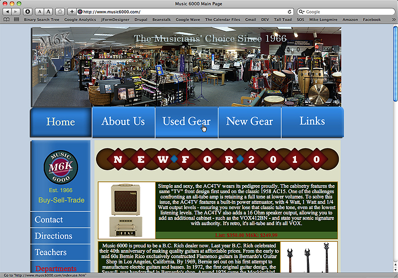
Last week I talked about my work’s (Music 6000) website and how I was trying out the cool shit you can do with CSS3 on a developer version of said site. Here is what the site looks like now:
When the pointer hovers over one of the site links, it switches to an opposite gradient image. The current page you are on is represented by an inner shadowed gradient image.
All of this is done with an old Javascript file that is becoming deprecated. Right now, depending on the browser you use, if you click on an image link, that image will disappear before the you leave the current page and the images on the page you are navigating to will slowly load. This is not ideal and I’m trying to come up with at least a temporary solution.
Below is a screen shot of the “new” version of the site with some of the CSS3 improvements:
When the user hovers over the links now, it brings about, roughly, the same effect. This is all accomplished with CSS and takes almost no time to load the page.
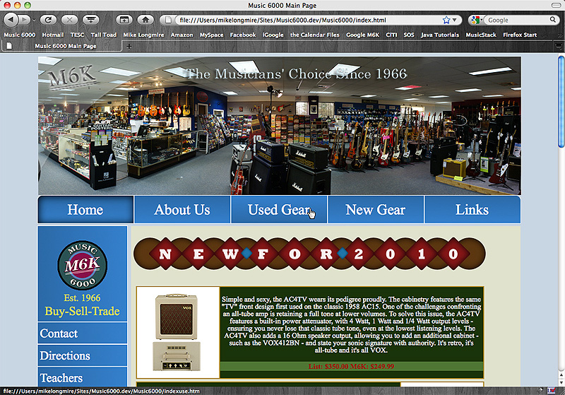
I got rid of drop-shadows and made the site wider. It basically fills the entire 1000 pixels I set the body to. I think it looks cleaner now. The big problem with this though is that, big surprise, Internet Explorer doesn’t recognize any of these new, wonderful CSS designs. That is why I have to come up with some kind of temporary solution.
Some of the CSS for the rounded corners and gradients:
Gradient:
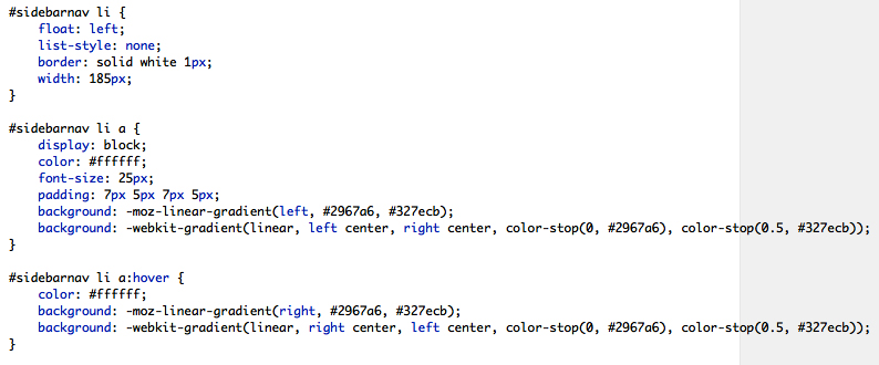
Box-shadow:
Radius:
Next is layout and floats. As well as redoing my personal site as an experiment with rounded corners that IE does recognize.
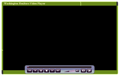
Mar. 30, 2010: Today Stevie set me upon the task of studying up on and building a Flash player that can run multiple videos in one player. He purchased one for the Realtors site from Flashloaded. It’s called the flvPlayerPro. I haven’t messed with Flash players a whole lot, but this should at least be interesting to try and learn.
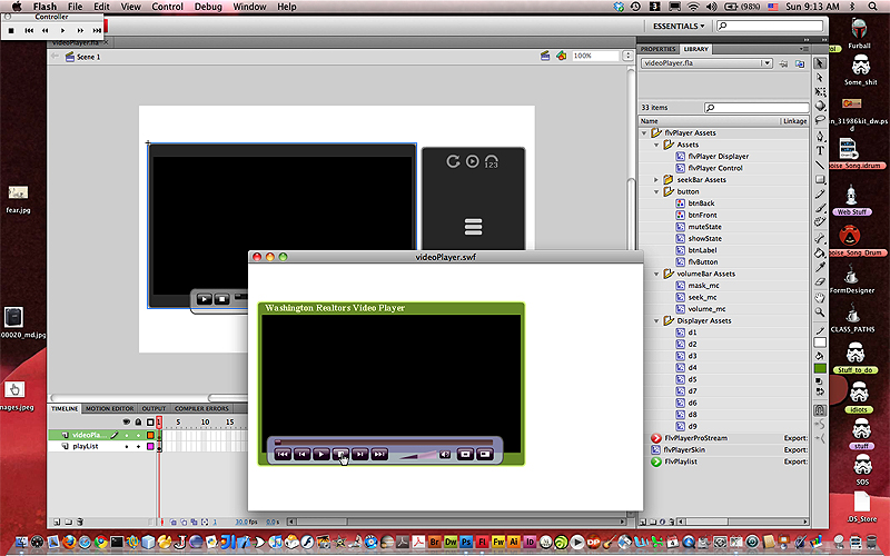
Apr. 1, 2010: So I started building the Flash player and it’s quite the pain in the ass. I think that this program was actually written for CS3 and can only take an ActionScript 2.0 file. Every time I tried to start an ActionScript 3.0 file, the parts I needed wouldn’t show up. So after much struggling for the better half of the day, I finally got something to be created:
Here is the Flash view. The original is in the background, with a menu for the multiple videos on the side. The foreground view is the skin that I made. The menu doesn’t show up, I believe, because we haven’t loaded up any videos.
So the new problem is when the player is increased in size by hitting the resize button, the skin doesn’t fully size properly.
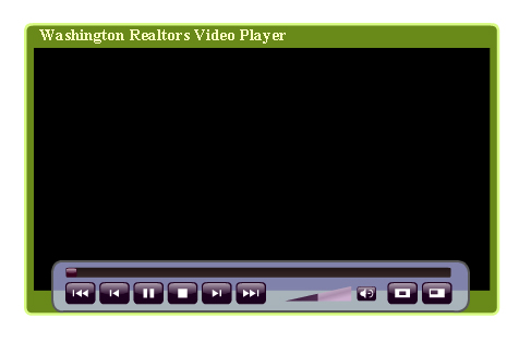
This is what the player looks like in a web browser window while at it’s default size:
This is what it looks like resized:
As you can see, the beveled edge goes up halfway on the left side and the top. I think part of this has to do with when I was working on the new skin, I wasn’t able to select three portions of it: the top left and right corners and the bottom right corner. As you can see, the top right corner and the bottom left corner is the original skin’s color. I’m not sure how to get around this. I guess that’s what I’ll be doing this coming week, troubleshooting.


Comment Crap